01
Four years as the translation layer between design and business.
The product.
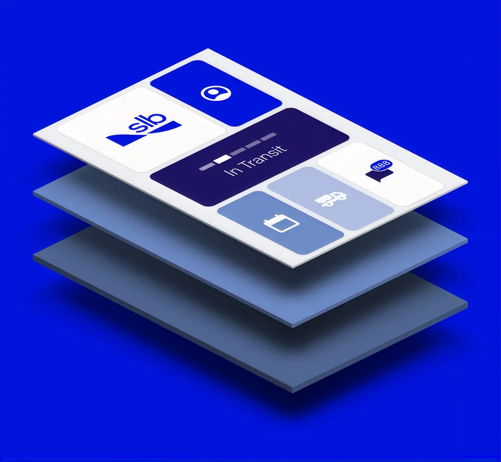
The SLB Customer app simplifies how customers manage complex oilfield operations. Think of it like Uber, but instead of tracking your ride, you are tracking high-stakes deliveries across multiple services, teams, and equipment.
The challenges.
The complexity of the product
Thousands of products and services, each owned by a different department, managed differently, running on different systems. Similar enough to share a spine, different enough to break it. Every decision had a domino effect.
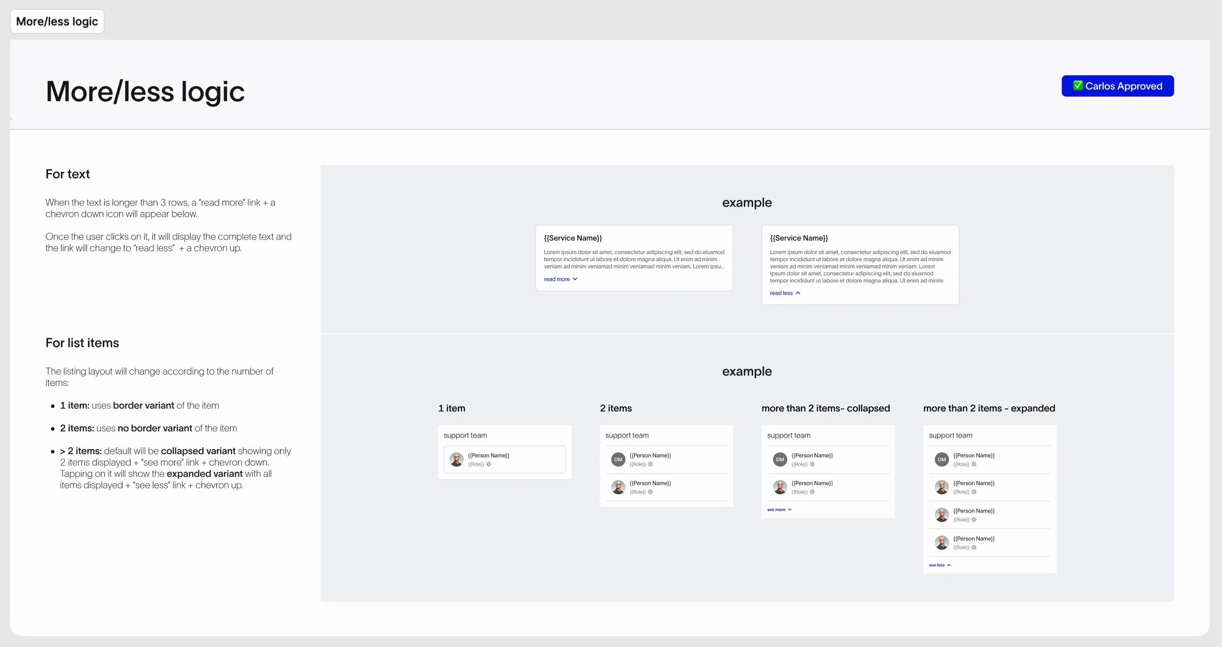
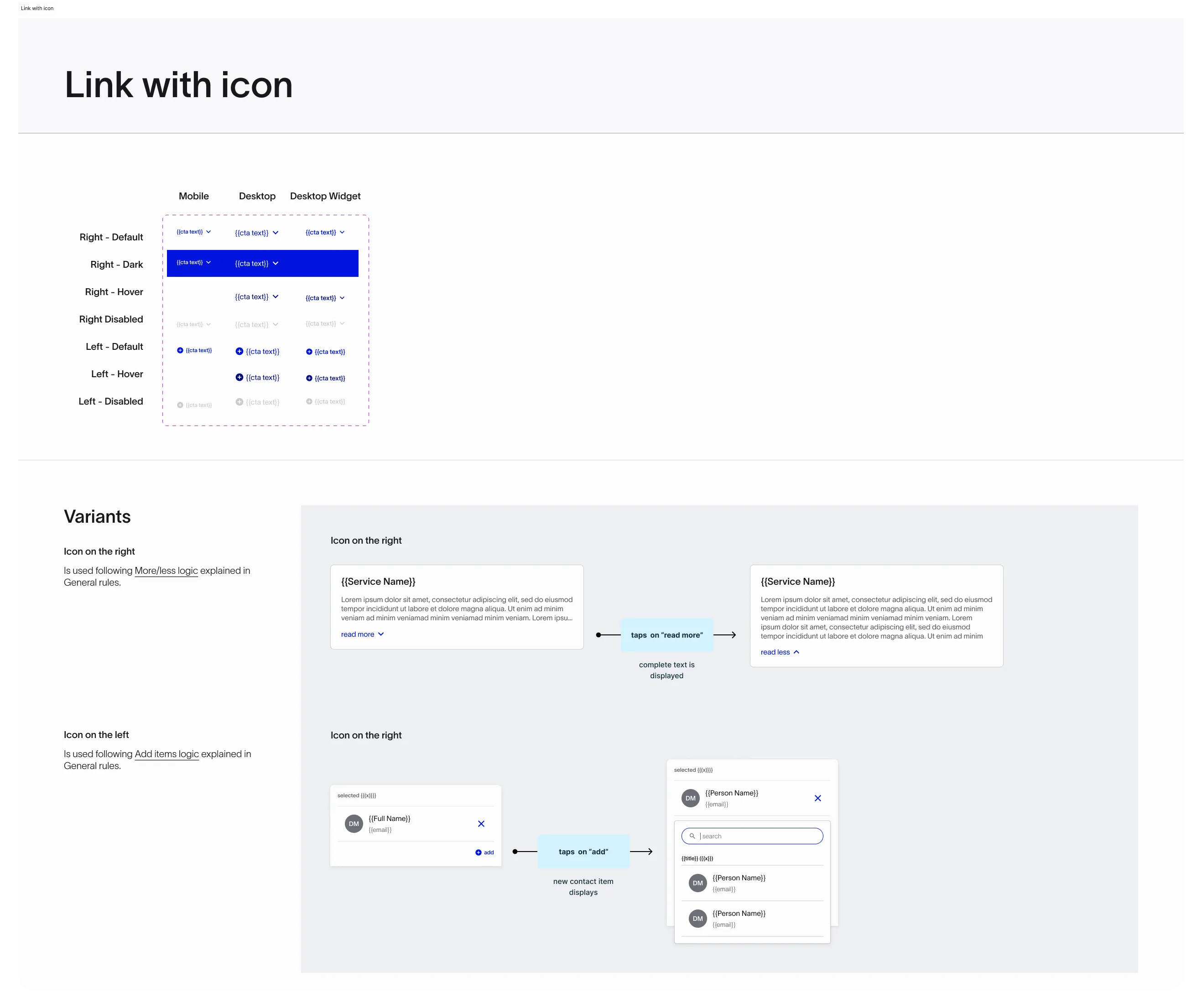
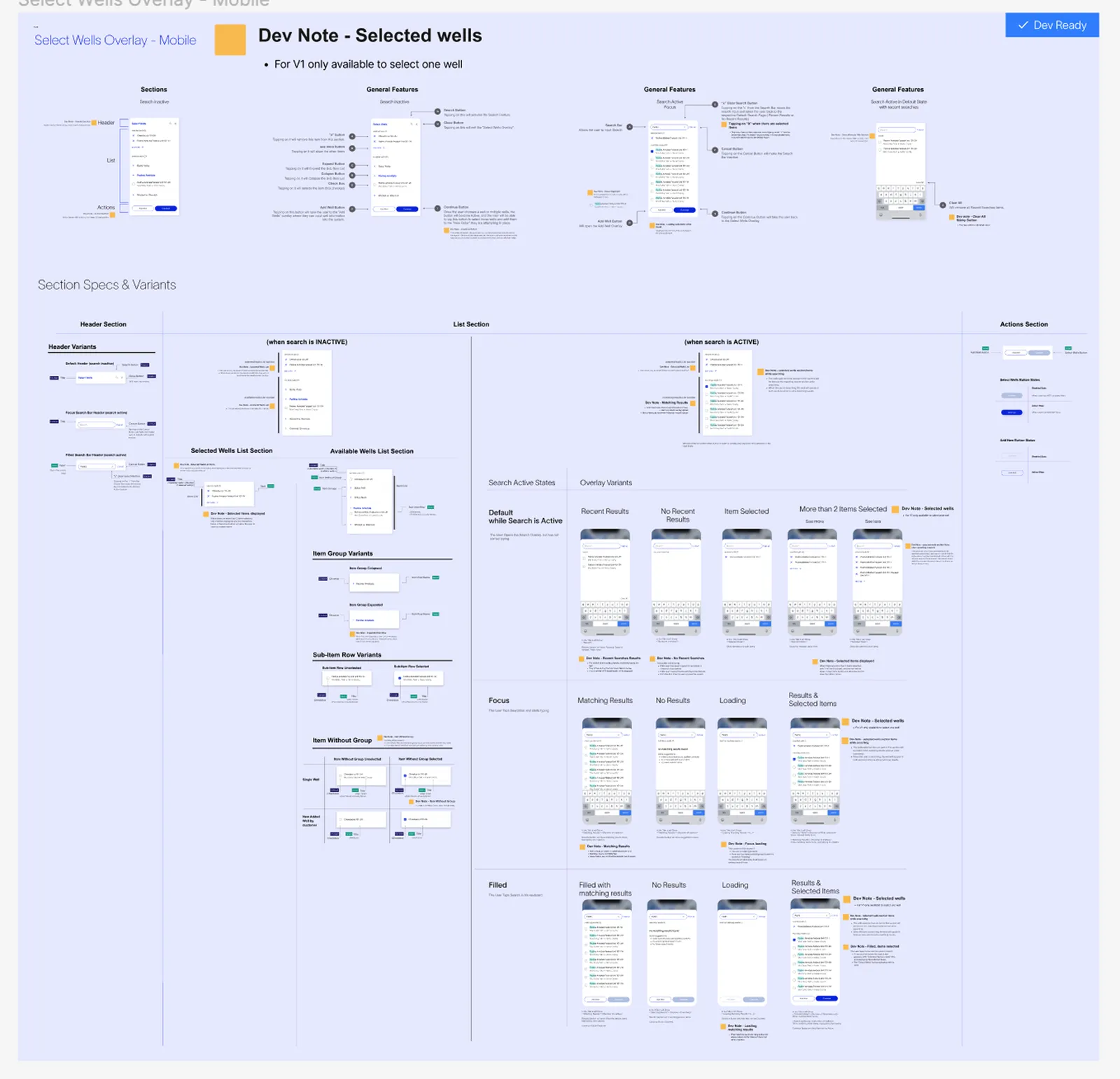
I found patterns as we went and built the system underneath: templates, reusable components, and the governance to keep them consistent as new services broke the model.
The complexity of the engagement
A core team of eight managers, each running a line of business, brought us the requirements. Behind them sat customer requests, executive direction, and new business lines waiting to be onboarded. Three development teams from different companies, with people changing constantly. A fast pace, where everything was needed yesterday.
Design had to do more than design. I helped orchestrate and built the translation layer between design and business, and set a rhythm that kept every part involved.
The way we worked
There was no process. Requirements went through one person to designers, who worked in isolation on pieces of the same feature. Nothing captured what had been decided, so feedback and iteration never ended.
I led the definition of a new workflow, involving the people who would have to work within it. Clear stages, owners, and approval gates, and decisions captured so we could point at them. We kept simplifying it as the team and the system matured. The process was never the point. A better way of working was.


One centralized experience.
%20cropped.pp-diY4R_tmeWu.webp)
-
Customer end-to-end
Request, manage, and track every product and service from one place. Live status on orders, deliveries, and approvals, so every team always knows where things stand.
-
Real-time updates at a glance
A personalized home feed surfaces what each user needs before they have to go looking for it.
-
Visibility and transparency along the process
Every step is tracked and visible, turning an opaque process into one everyone can follow. Notifications and a shared activity trail keep field crews, office teams, and the client in sync.
-
Centralized deliverables
Documents, sign-offs, and records in one auditable system, available anywhere, even offline in the field.
The hardest sell was not the design. It was funding the foundation.
RESULT
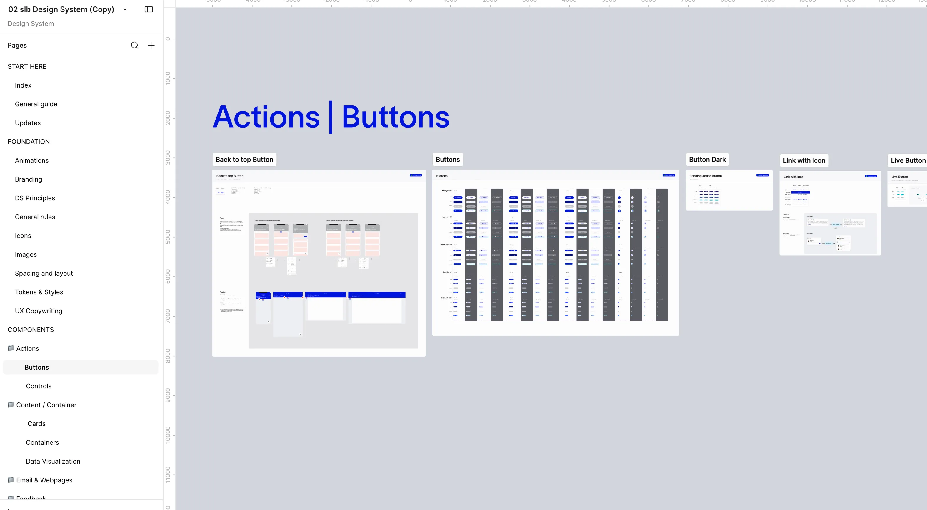
570 Figma variables, 350 components, tokens structured to flow through the Figma API into production code. And no one had to ask the person who built a component how it behaved.
The client saw a design system as a designer's tool, not a business one. So I showed them what it buys: patterns people navigate without thinking, tokens that update the whole platform at once, a shared language so design and engineering stop translating before they build, and less debt compounding under every release. Build the foundation, and every screen after it ships faster.
What we had was a UI kit. New, no guidelines, everyone building on it their own way. Designers used different logics and names for similar things, working in silos, and the inconsistencies compounded with every new service.
We needed a design system: patterns, guidelines, dos and don'ts, and someone with the authority to decide. I set the direction and the governance, and named an owner to hold the system end to end.
Knowledge should not live in people's heads.
I brought in a front-end engineer from our side to pressure-test the audit and the plan, and he worked alongside the design system owner on naming and structure so we had a solid proposal.
The last piece was tokens. I led with a short audit, a plan that would not stop production, and the value in their words. The work crossed budgets I did not control. I made the case anyway, and they funded it.
What the platform became.
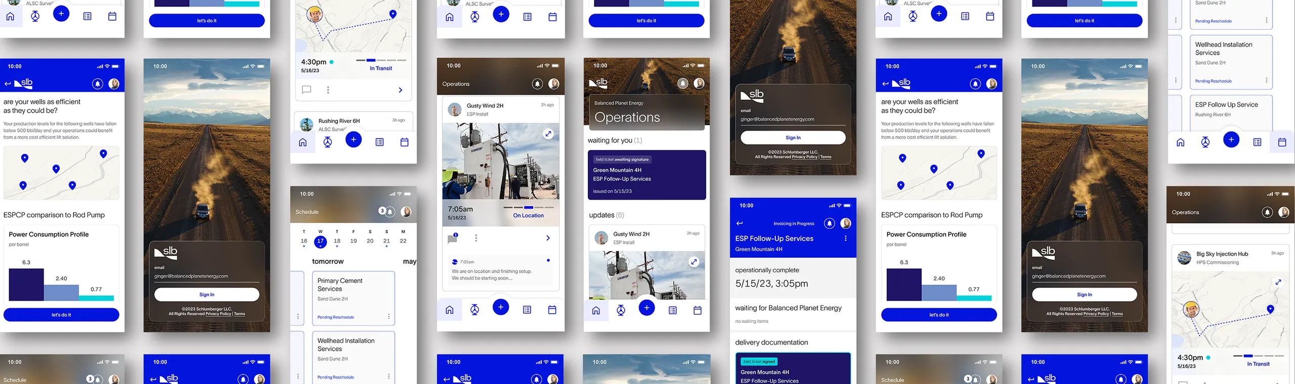
We transformed analog, paper-heavy workflows into one unified digital experience, built to scale across new business lines, products, roles, and regions. From ordering to tracking, everyone stays aligned with real-time visibility across the whole journey.
Before
After
The impact.
20 → 1
phone calls to a single digital action
Unified digital experience
A consistent experience across mobile and web that matches real-world workflows. Centralizing service requests, updates, and communication into one system.
570 / 350
Figma variables and components, with tokens structured to flow through the Figma API into production.
Scalable design foundation
A design system that aligned UX with UI, so the team shipped faster and more consistently.
2 mo → 4 yr
average designer tenure on the engagement, from under two months to four-plus years
A team that stayed
Core designers at four-plus years, and one who went from co-presenting with me to running his own client engagement.
“Her design instincts are sharp and her judgment as a leader made everything around her better.”
The leadership.
I joined as one of the designers and grew into leading from within.
Four years of building what made the product possible: the trust, the rhythm, and the team.
The client
Eight managers, each running a line of business under real pressure. Business and design spoke different languages, and someone had to translate.
That became part of my role. Business pressure turned into design decisions, and design decisions turned into business language. Conversations moved from “yes, we’ll build it” to “what are you actually trying to achieve?”
Early on, decisions travelled up through one person and detail slowed everything down. We changed how design showed up: evidence, industry standards, and reasoning underneath every recommendation. Over time, trust replaced review and we were given more room to decide.
The orchestration
The work was not dysfunctional. It was un-orchestrated. No one held the whole picture from the design side.
I worked with the team to establish a rhythm the engagement could rely on: ceremonies, critiques, reviews, and presentations.
The rest was context. After four years, knowing what had already been decided, what was still open, and which conversation needed which person was one of the most valuable things I carried. A designer working with one manager knew things nobody else did, and part of my job was knowing when that knowledge needed to be in the room.
The team
Before me, average designer tenure on the engagement was under two months. The churn drained continuity, knowledge, and trust.
Designers were being interrupted all day and did not feel they could say no. We agreed a way of working that everyone could live with. I coached them on presenting: pros and cons, evidence, industry standards, and on the specific things each person needed to strengthen. When someone was strong at something, they taught it. That is how the team became one rather than several.
“More than a designer, Sol became the vital bridge between product, design, and development.”
“She balances client advocacy with team mentorship, creating an environment where I feel supported and empowered.”
What I do when something isn’t working.
Before
Epics never ended, and nobody could say why. Requests changed along the way, feedback arrived as “I don’t like that icon,” and months later no one remembered who had asked for what, or why.
The workflow
It was built with the people who would have to work inside it: designers, the managers bringing us requirements, and development. If they were going to adopt it, they had to own it. I presented it to the client myself, what each step was for and what happened if we skipped it, and they backed it.
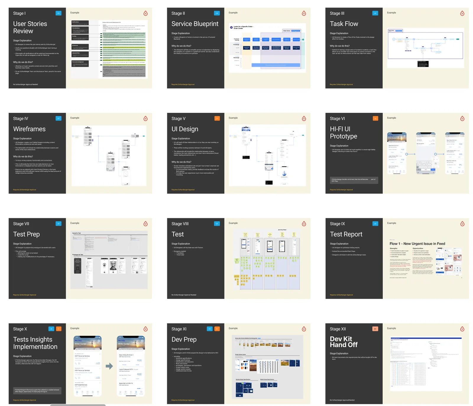
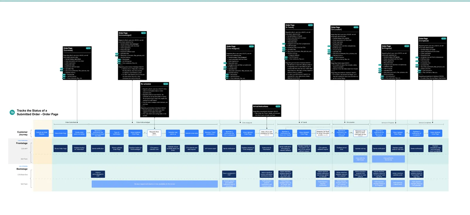
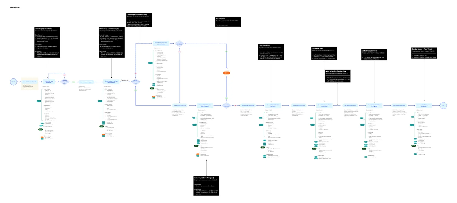
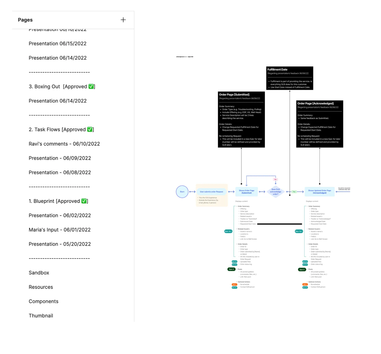
Twelve stages, from user stories review to developer hand-off. Every epic started the same way: understand the request, ask questions, and push back where a nice-to-have was dressed as a must-have, so it went to the backlog instead of into the build. After that it depended. Some epics needed a service blueprint, some went straight to task flows, and once the design system was solid, a small feature could go straight to high fidelity.
What it changed
Feedback was captured with a date and a name, and every round started a new page in Figma. Anyone could see status at any point, and if someone asked why a decision was made, we could go back and read it in context. It also showed the client something they could not see before: how much they were changing, and where they were not aligned with each other.
Twelve stages was scaffolding, and it was meant to be. Once there was trust and the system had filled out, stages merged and dropped away, meetings got fewer, and “I don’t like that icon” became “can you show me some options?”
We became one team.
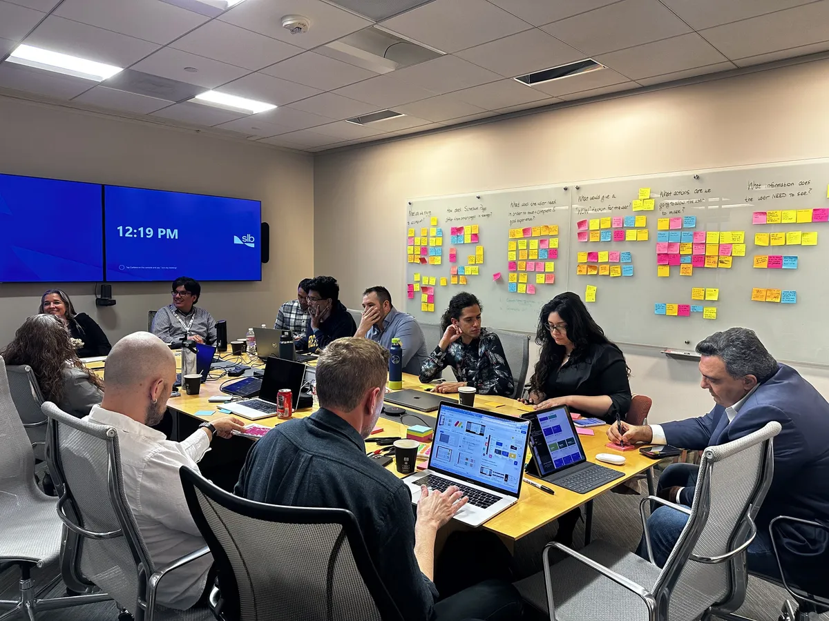
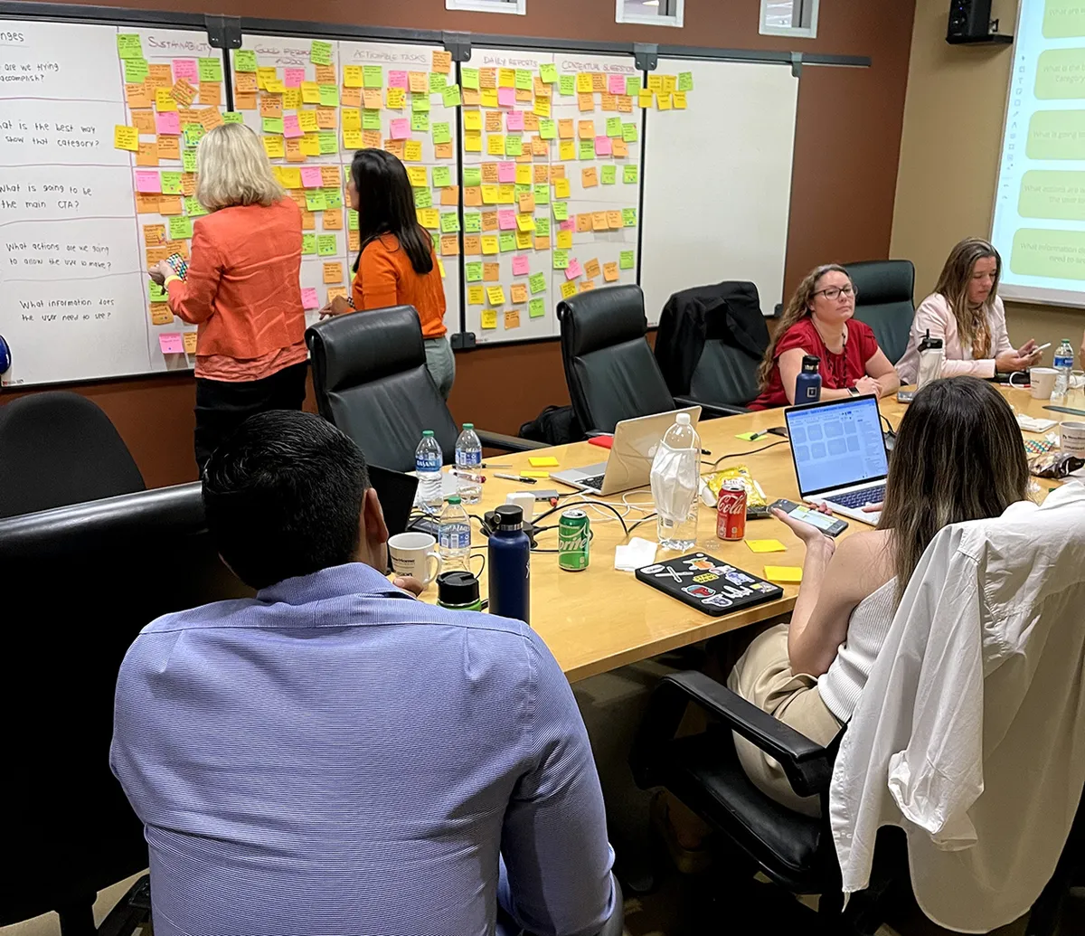
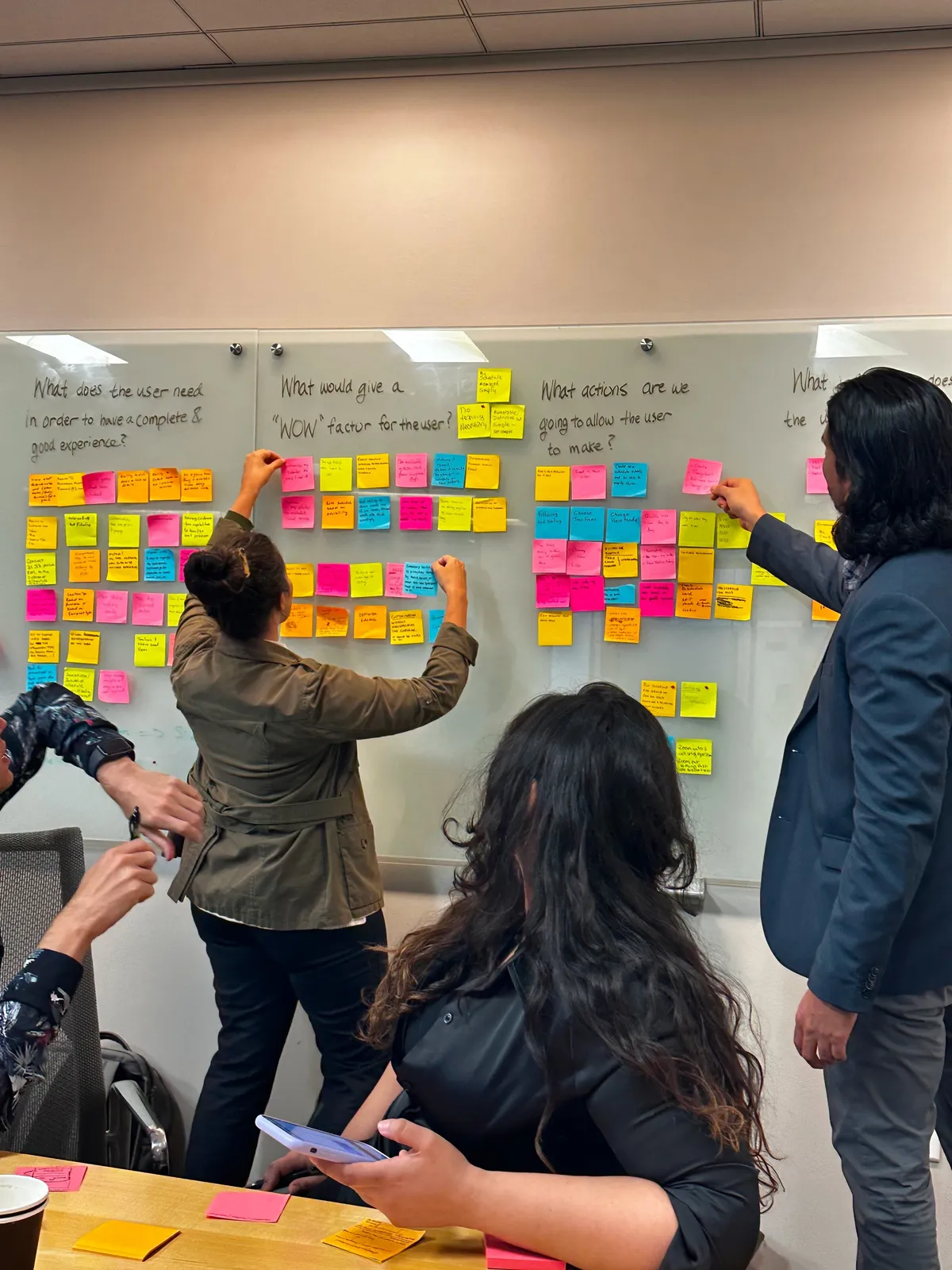
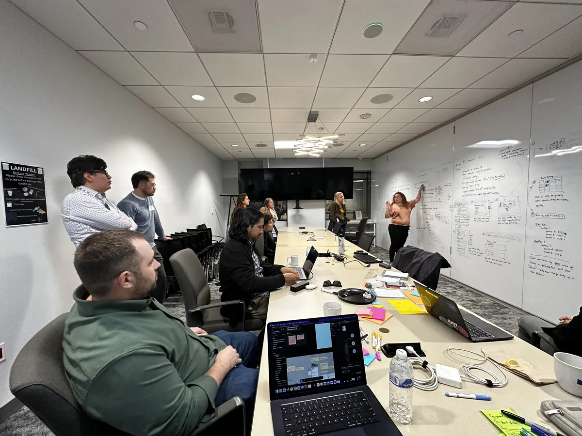
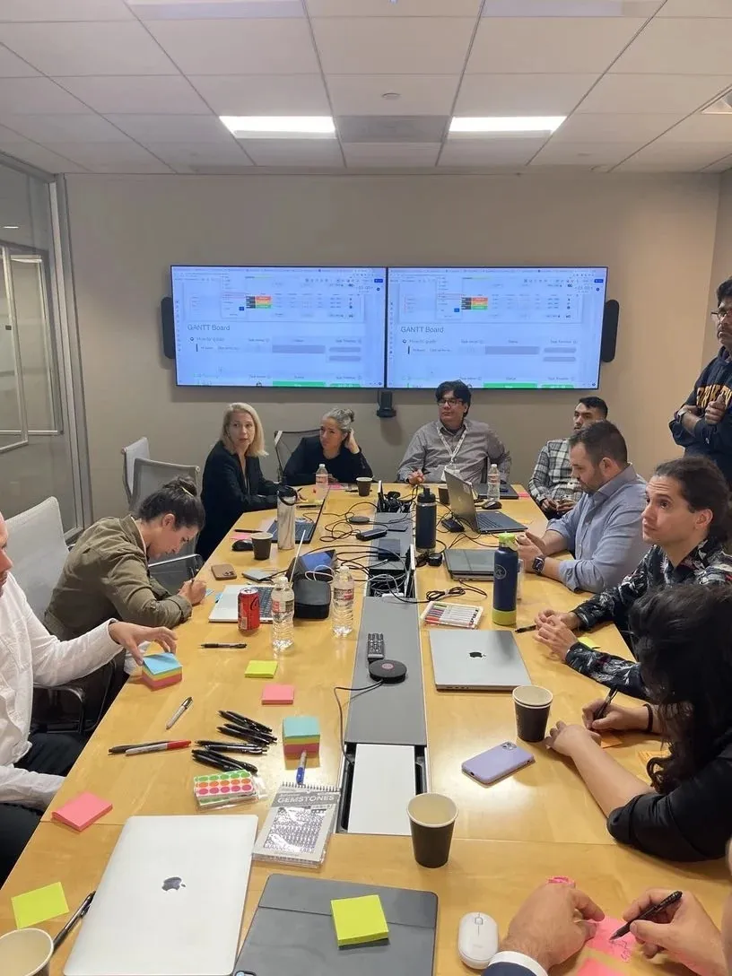
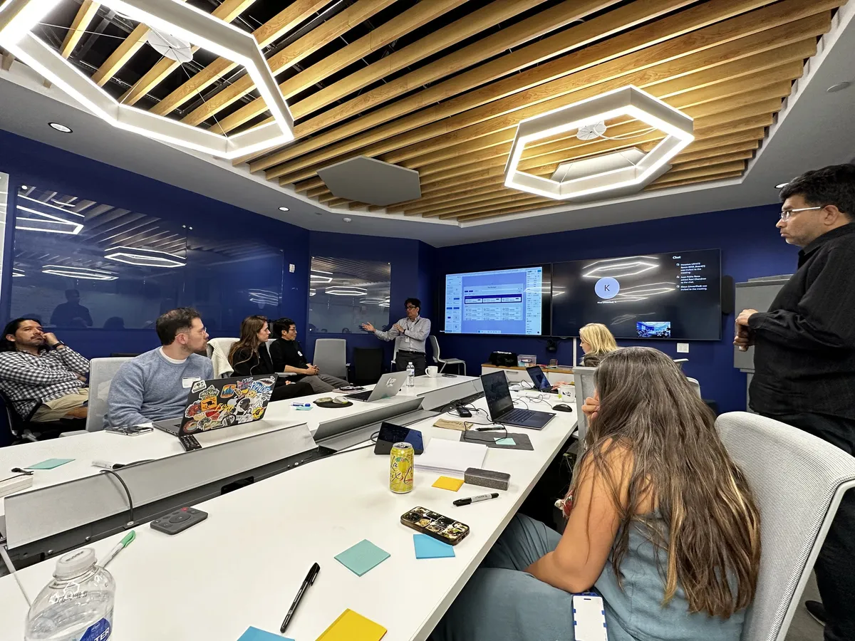
Four years of workshops with the same client: mapping needs on the boards, critiques, planning sessions, and executive reviews.
REFLECTION
Four years inside one client teaches you what shorter engagements cannot. Relationships compound. Trust compounds. Decisions compound. You stay long enough to live with the work, and that changes how you make it.